Rhythms QAL Preview: Selecting fabrics
Isn’t this the most intimidating part of the quilting process? You’ve chosen a beautiful quilt pattern, you have the recipient in mind, but now it’s time to select fabrics and the options are ENDLESS. With an infinite combination of prints, solids, textures, etc., it’s overwhelming! The key to selecting appropriate fabrics for the Rhythms Quilt is to balance contrast, print scale, and hue. What does this mean? Well, let’s get into it!

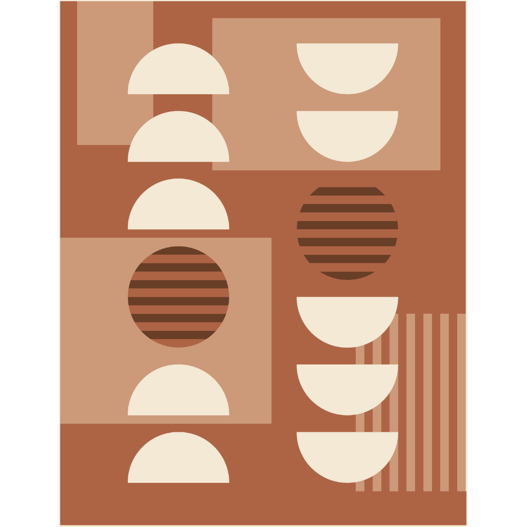
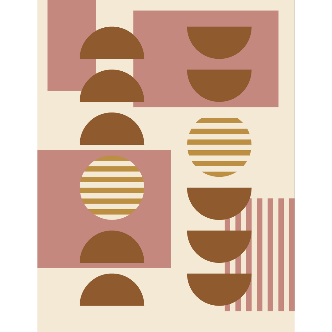
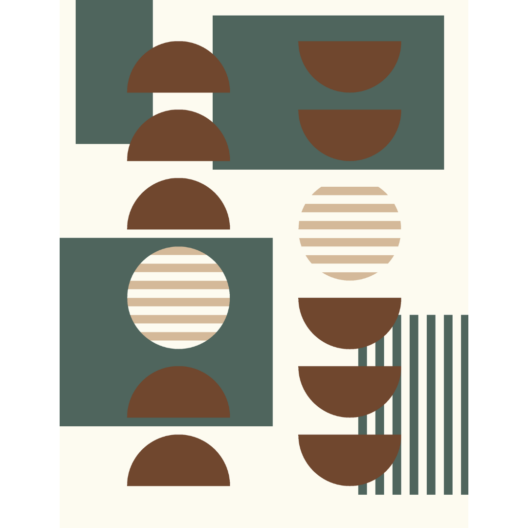
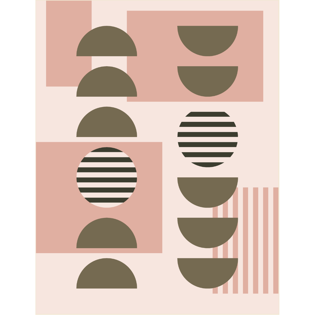
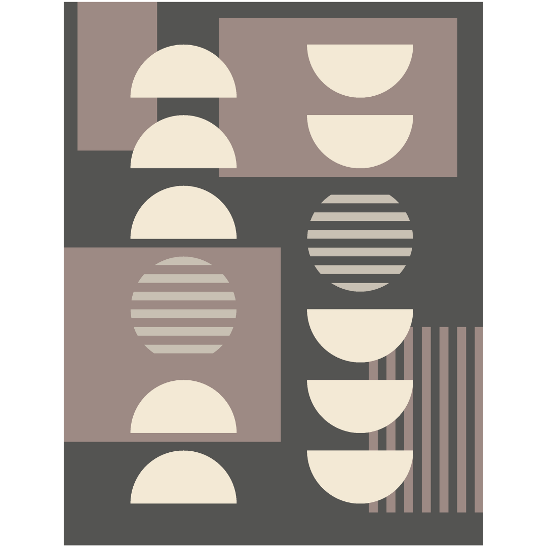
Example of 4 fabrics with warm undertones
Fabric Selection Tips:
The Rhythms Quilt lends itself well to solids, so when selecting them, there are a few things to keep in mind.
The underlying hues of the fabric should coordinate. For example, avoid a warm toned white and a cool toned grey, or a cool toned green and warm toned brown. Even if the colors are a creative palette, the underlying tones of the fabrics should coordinate. It can help to lay your fabric together and take a photo in natural lighting. Examine the photo and see if the fabrics look like they belong next to each other.
Pay attention to fabric texture. This pattern is not technically complicated, but each step builds on itself. It is important to minimize distortion and stretching when piecing curves and stripes to achieve a good result. Choose fabric that is sturdy enough to handle the piecing process. Fabrics with a silky texture can be challenging to work with for a new quilter. A more hearty fabric like Cotton and Steel, Riley Blake or Kona, may make the piecing process easier.
Use the coloring sheet to balance the quilt. If using a combination of dark and light colors, it is important to verify where the colors will land on the final quilt. Ideally, the tones should be distributed evenly. It is more visually pleasing to have dark colors interspersed with light so that one portion of the quilt does not become “color heavy” in comparison to the other areas.
2. If you want to experiment with adding prints to the Rhythms Quilt, here are a few guidelines to set you on the path to success.
Choose a low volume blender print for Fabric A or B — the background fabrics. If you have a large, loud print you love, use it for Fabric C or D. The large prints provide visual impact, the low volume prints allow for blending between the other fabrics. The beauty of this pattern comes from the blending and contrasting of the colors. A & B should contrast on a continuum to create the look of depth in the design; C & D should pop against the subtle background.
The goal of a contrasting fabric is to create distinction. Avoid choosing all “statement” prints, and choose one, maybe two, prominent prints and then opt for blenders or solids in the remaining fabrics. Below are two examples of prints incorporated into the design.
These distinctions aren’t hard and fast rules, and some fabric can fit in multiple categories depending on the surrounding prints. There is room for creative license! These are guidelines, but it’s your quilt — be bold and go for it!


There are so many options! Be creative, but keep these guidelines in mind when selecting your fabrics. It will guarantee a much more pleasant experience with the pattern!